I believe i have grown more confident in my art since the beginning of the year. I am more open to exploring and trying things i never thought would interest me. At the beginning of the year i really enjoyed the freedom and control i had over my work, and what i could explore artists wise. To see how different everyone's work turned out in the class was very interesting and even exciting. The freedom allowed me to explore different techniques and develop my own skills, as well as new ones, that interested and felt relevant to me. The lessons i struggled with the most was when we were made to create a piece without having previous time to explore and develop a meaning to it. I enjoy creating a meaning and being able to explore it in every little detail in my work, when made to create some piece with no meaning i felt lost and wasted time trying to put something together that made sense. Usually i found i disliked these pieces as they became an irrelevant mess as i rushed creating it in the end once i gave up trying to find a purpose.
When working in creating six sketchbooks, with the short time we had, i accidentally fell behind on blog as i became engrossed in working in my sketchbooks. My creating technique is usually quite improvised as i get new ideas whilst making a piece and continue on to the next page. This was pushed further with short time, meaning i needed to get the sketchbooks done first. Before i knew it i was six sketchbooks behind on blog. Now i feel more prepared and in control of updating my blog so i don't fall deeply behind. I find the explanation and new developing ideas are just as important as the artwork as i come up with new ideas whilst analysing my work.
My first project was heavily influenced by music and books as i explored fantasy vs reality. This was personal for me as i believe i am a maladaptive daydreamer and by exploring the effects of constant daydreaming it helped me understand my situation better, even trying to daydream less and be more productive. Despite it being personal for me i feel i still distanced myself from my work as i didnt talk or exploit specific details that relate back to me. As an artist i want to grow and be comfortable to show my feelings and personal life. I understand it will take time to do that but it is something i want to constantly be working towards.
Doing small workshops where we try new techniques were really helpful for me as i learned new things that i could incorporate into my work. I love finding and reusing new materials in my work, mixed media is something i have grown strongly for and find it difficult to resist as every piece turns out incredibly unique. Despite my admiration for fabrics and sewing i feel my skills lack hugely in this area, mainly because i lack patience. This is something i should develop next year and explore in more detail. This year i was able to do this for my drawing skills. After GCSE i didn't find time for drawing and needed to get back into it, over the summer i plan to continue developing my observational drawing skills and even expand to painting.
Painting is another medium i thoroughly enjoy but never knew how to explore. I love watercolour, oil and acrylic. I especially enjoy vibrant colours and bold paint strokes where you can see the colours mix and layer. Over the summer i plan to develop my drawings into paintings on canvas as i have never painted on canvases before. Then next year i plan to create my own style of painting, trying different materials to use as a canvas such as wood, metal and fabric. Then bring in mixed media into my work once i feel confident in my painting style.
Photography and 3/4D work was something i could never picture myself doing at the beginning of the year. Technology has never been a strong point of mine but i enjoy taking photos and creating the image that is in the photo. Being able to step into my art is very indulging. Probably because its similar to stepping into a daydream for real as it is brought to life. I really like the idea of the viewer being able to step into the artwork and be able to walk through it like a mini world. I found throughout this year i kept stepping into using 3D materials and creating bigger ideas that i felt was impossible to create by lack of materials, space and skill. Photography is definitely something i would like to develop, creating photos using different cameras like vintage ones as well as exploring light and staging the photo. I would like to try body art too as that will combine painting, modelling/photography and the human body (which i find very intriguing to draw). As for the bigger, 4D ideas i have, i feel i need to grow more confident in my art and become more assured in that area before attempting it. For now i want to grow with the skills i already have and learn to combine it with 3D artwork, that way i will be more prepared for using 4D material.
Saturday, 2 June 2018
Friday, 1 June 2018
Final Piece: Evalutation
 For my final piece i looked into materials, social media and photography. I decided to try doing something completely new as my focus instead of my usual use of painting. The photos show a story of someone who is vulnerable and unhappy with their body image due to social media depicting a "desirable" look and life. This has reflected poorly for their mental health as they follow the beliefs in society's expectations (represented by the weeds), nourishing and accepting these viewpoints. In the attempt to fit into the expectations they have dangerously damaged their bodies. There are about 1.25 million people suffering from an eating disorder in the UK alone. Since 2005 these numbers have raised by 7% each year and anorexia has the highest mortality rates of any psychiatric disorder. It is difficult to know what causes the development of an eating disorder between family genetics or environmental factors. However, the influence that social media has on people, especially young and vulnerable ones, is massive. I found many negative comments online towards people who were not stick thin. Unwanted comments attacking a stranger for how they look, i found it devastating; people learn to insult and mock others instead of learning that everyone is unique and beautiful.
I wanted to show how horrible and painful it is for people who suffer eating disorders, and the many who hate their bodies as they were not taught to love them. I wanted to exploit the feeling of isolation and danger the sufferers go through instead of creating a piece telling the viewer to love and accept their body. This way they can understand the pain themself and see the horror, therefore able to make the conscious decision that this is not alright. People remember the devastating images more than happier ones, i believe they will remember this piece more and make them want to act on it.
 I chose a colour scheme of black, white and red. I wanted the photos to be dark and empty, conveying the feeling of loneliness and loss of hope. Black is very heavy in the photos, engulfing the body as the body becomes weaker and thinner. The colour is death and grief. An eating disorder can take over and rule someone's life, that person dies and they grieve as they lose control mentally and lose their body. I wanted a simple monochrome set in the photos as to not distract from the red. The white is only slight, shown by the bright light and pale skin. It stands out coldly from the black, looking ill and lacks personality. The light and no face also shows how they have lost their life from before, their body's appearance is the only thing that matters to them, which is why they are the centre of the photos. The red fabric helps the dark photos to stand out as was as convey pain and scream danger as it grabs the viewers attention. The red fabric is used in the photos when she hits breaking point and is completely lost, The damage has been done to the body. When setting the fabric up for the background, i used my window which shone sunlight through the fabric, lighting it up to a red blaze. I found this very captivating as light has always interested me in art. The colour continued to burn through the photos as well, making the skin appear red, i found this effective as it created what i was trying to show with using the red fabric in the photos. However, this also made the photos lose details, such as the red fabric loses its purpose as it does not stand out in the photos, now looking lost. I also lose the little sewing details and water marks that i created on the photos. They stood out boldly as the skin looked so pale. I feel that the light helped add an alternative sinnister feel to the photos but caused it to lose to many others.
 Once i printed out the photos on paper i dripped water to make the ink run on the skin. This caused discolouration and unpredictable markings that convey a decaying look to the skin and photos. I feel it helped show how the body was wasting away, additionally i let some water drops run down the page. This caused for the markings to look like tears that have run and stained, showing her sadness as she suffers alone. I really like the unpredictability and unique markings that the water creates, however i could of chosen one specific way to mark the page such as random water drops or letting them run in straight lines. Furthermore, i could have tried only wetting certain areas of the body and create certain markings like a straight line of dots to highlight the spine on the back. I also sewed on features of bones using red and grey thread. I wanted to use a free hand sewing machine so it looked more wild, however, i didn't get the chance so they look too simple and have less of an impact. Additionally, i wanted a lot of loose hanging thread, to mimic the pouring red fabric in the photos like blood but struggled to create that appearance from the simple sewing.
 Three photos printed out when the printer ran out of black ink. This creating an interesting fading effect on the photos, i felt it encouraged the idea of losing control and of oneself. However, the colour turned pink and i feel that it doesn't really fit in with the colour scheme, if it faded to white it would've worked better however the change popping up throughout the photos help keep and interest when viewing them all. To improve the photos i would want to work on the staging of the body so it would be more central and in the same place, as when viewing them close together the constant ,move around is distracting and makes it look confusing, even messy. This could convey the disruption and distress as they suffer however, i think i would prefer for the bodies to be in line so the body language is clear to see and compare the changes from photo to photo.
 Lastly, i sewed all the photos together, this was difficult as the sewing machine could easily rip the pages. I used zig zag sewing as the back and forth motion shows how confused she is feeling with all the feelings of hatred darting around in her mind. Unfortunately not all the photos ended up in a straight line which really irritates me. I wanted them straight so it would be like following a photo film strip.
  The background/border is the weakest element to this piece. I wanted to sew different red fabrics together, with ripped gaps to look ruined. However this was difficult to create as i had nothing to support the fabrics to hang straight and not droop. I needed something like a wooden board to spread the fabric on so it would be straight. I did my best by hanging the fabric from my window curtains and tying the corners to the rope that bordered the fabric. To me this looked sloppy and the rope looked lost, even unseeable as the light blocked it out and the remaining fabric covered it. If i was able to have ripped the fabrics and support the border i would of been able to tie the loose fabric ends to the rope. Allowing the rope to have purpose and look fixtured and strong, like in the photo as it is strangling her body. Lastly, to improve this i wanted to paint on the fabric with black paint and PVA glue. I wanted to create weeds growing up the fabric I believe the weeds are very important to understand the meaning of this piece and therefore need to be highlighted more. It would also help bring all of it together, the detail would bring it towards the smaller details in the photos that need to be seen in order to understand the impact and suffering.
To develop this entire piece, i could have little scraps of red fabric with sellotaped transferred versions of these photos. The piece would be in a line, spread out on a plain white wall that i could paint little black weeds growing up on. A small rope would be woven in between and connecting all the pieces. The photos could be different and be taken so it looked as if she is pulling the rope tighter.
Final Piece: Dulcamara
"Dulcamara" is a combination of latin words meaning "Sweet-bitter". I took it from the scientific name "Solanum Dulcamara" for the poisonous plant, Bittersweet Nightshade. I felt that this was a fitting name as my final piece is about social pressures that can begin the down fall to anorexia. Society paints a pittoresque picture of thin bodies through the media, they are seen as beautiful and most successful- sweet. However, this teaches people with different bodies that they are not beautiful and through unhealthy diets that are advertised, people dangerously try to achieve unrealistic bodies that causes them to develop anorexia. The media deceive people through photoshop and take advantage of vulnerable people, creating bitter, judgemental minds instead of teaching others to accept and love others differences. My piece highlights the danger of this influence, showing the suffering of one's mind as they struggle with their bodys image. Taking in the views and expectations of society that are represented by the weeds in the photos. Weeds are unwanted and can kill other plants that are trying to grow, much like how the media does not represent all ethnicity, race, body types, and sexual preferences.
Wednesday, 30 May 2018
Final Piece Plan:

 On a select few, one from each row, i would sew some bone details on using red thread and sew all the photos together. I still wanted to use most of my original idea materials. Especially the red material as that would stand out from all the black in the photo, highlight the danger that is being shown and draw attention to the whole piece as it is a bright colour. I thought using it as a border would work then so it wouldn't split the photos up or be too overpowering.
Using the rope as the overall border would link it back to what's shown in the photos. The red fabric would be tied around the rope, with ripped gaps so it looks ragged. Almost like a stretched spider web with a fly caught in the middle.

Using the rope, i would hang the whole piece up but not against the wall. I think natural, outside light would work best so nothing is too distracting or dark, hiding the piece. I think hanging this outside in an area where it is overgrown with weeds would help bring attention and naturality to it. Therefore showing how this is happening in the real world. On the other hand, i think taking a photo in two different settings could change the tone. For instance having this hung in a dark room with spotlights on it would bring back the photoshoot display idea and would be quite dark. However, i decided that this is already displayed in the photos as they were created in the same setting and are quite dark as the main colour is black. Therefore using a contradicting setting of the outside with natural light will let the viewer breathe and understand how unhealthy it is for a person to be suffering with these mentalitys.
I especially like the idea of having the piece hung up and be able to turn around. I was thinking of dripping black paint and pva glue on the back and create images of weeds growing on the red fabric. Additionally, as i still have the black fabric i could still create the original idea on the back. This could be too much in one piece but both sides show the same image and slot into each other nicely.
Editing Photos
 Using my iphone camera edits, i edited a few photos. I especially like the first one as the darkened photos creates a very ominous and forbidden setting. The little light on the skin helps accentuate the ill looking body. The third photo was very interesting too as the body was radiating with light and the shadows really took over. However, the skin looks quite warm creating a summer evening feel for the photo so the tone was not correct. The fourth photo i felt was very effective to take away human presence but it was too much. I feel that effect would work best for a very distinct photo of objects, or patterned style that repeated as the black and white took away the features that some photos need for it to appear right.
The next page the photos did not print out how they were on the phone. The first photo became very dark but the red fabric became the focus and very luscious in colour. I think it looks very artificial like photoshop is but there is a very strong yellow undertone which doesn't appeal to me as it makes the skin look too warm, which is a distraction.

 The next photo was very light, it looked to me like when the photo becomes washed out from the sunlight. I thought the edit was interesting but didn't work for the tone i was trying to set. It could work to show how she is worshipping the weeds but it would look to odd from the rest of the photo sets.
The last edit had a good balance between the dark and light. The body and red fabric is quite lit and becomes the focus but still dark from shadows that surround them as if it was about to engulf them. I think this edit is quite fitting especially if the beginning of the set was dark like the first edit and slowly becomes this, showing how they worship the views and are being praised for the wrong reasons instead of people encouraging being healthy and happy at the beginning.
 I printed the photos out on a full page and dripped water on the pages to make the ink run, which i tried at the beginning of my sketchbook as an experiment. I really like how the ink runs bringing out the red and blue colour. It created a good mix of the natural photos and the no black ink photos. Showing her decay and loss of identity.
I tried sewing a bone on the arm to highlight the effects of anorexia. I used a blue thread similar to the blue brought out in the washed ink. However, i think using a thicker red or black thread could work better so it stands out more boldly on the page. This could be quite effective if i used the free hand machine and sewed most of the body creating a skeleton on the face. That way the random bones won't look so lost on the page and would convey how out of control anorexia can become as it takes over, wasting away the body to bone.
Photoshoot

I created a black backdrop so the black fabric would blend in and the skin appear more illuminated and becoming the focus. I had never done photography before so i used this as my chance to mess around. The main thing i had to learn was how the lighting affected the photos. At first i had my curtains open, using natural sunlight. It helped create shadows and warm lighting on the skin, however it was difficult to get the camera to focus when the light became too bright so i closed my curtains. Closing the curtains made the photos darker and colder. My skin looked more blue and it helped set the unsettling, sad tone of illness that these photos were showing. On the other hand i wanted to experiment with lighting a little, so i got my lamp and through the rest of the photos i moved the lamp around to light up different areas and create shadows.

Picking details from my original final piece idea, i tried to recreate them in the photos. Using the black fabric as a dress, i collected weeds, tied a rope around me, and used the red fabric to show the development of danger and suffering. When following through the photos, they show a story developing. The first photos show a person with low self esteem of feeling lost and vulnerable. They are already thin but unhappy, due to the negativity shown in the media. The photos where i am holding weeds show how they start to take in the media and society's beliefs, picking the weeds and keeping them. Their mind set changes as they water the weeds believing this is right and unable to see the health damage they are pursuing. Becoming wrapped in the rope, suffocating and watering themself as they have become the weed, following and spreading the views that they have taken in. The red fabric represents blood and tears as they suffer, possibly even dying from anorexia. Lastly the photos with the lights show how she has lost her identity, he happy life from before as she has became what society wants.

I printed the photos out again, this time with no black ink. This made the photos print out with electric blue and pink ink. This effect changed the tone dramatically from dark and sinister to summery due to the lighter colours. However, i see the photos as less human. The body looks unnatural and the world is unreal like an alien planet. I believe it shows how inhuman people are when they believe in one particular view that outcasts many humans because they don't fit. The viewer loses the ability to connect to the photos as it loses its humanity's touch. This also made me think about how i could edit my photos and try different styles to test the outcomes.

These photos turned out better than i anticipated and enjoyed creating them as i am very interested in the body, drawing the body as well as body art. To improve these photos i would want to change the staging so the camera could be higher and take in the floor properly. If i had a better set up i could of tried more ambitious positions instead of kneeling on the floor throughout. Furthermore, i would want to develop the lighting skills. Try different coloured lights, shapes and alternative lights instead of a spotlight, such as fairy lights. I find the lighting very important as it highlights the areas you want focus, creates shadows that help set the tone and create the overall mood and feeling of the photos. Photoshop is another option i could try but i don't like being too technical and prefer creating the actual piece in the actual photo so it's as real as possible.
As these photos turned out quite well and showed the story i wanted in my final piece, i decided i would develop and use them.
Final Piece Original Idea
 I sketched out a final piece idea, my first one combined the different styles of the artists i first looked at. I thought about combining different cotton fabrics by sewing them together and then dying half of it in a blue colour. This idea was pulled from the artists Sarah Symes, with her improvised style of dying shaped fabrics and sewing them together. Then i would take square/rectangle shaped fabrics and sew them onto the cotton. Blue pieces on the white cotton and white on the blue cotton so they stand out. I could possibly use a gradient of blues like the artist Derick Melander, also reuse old clothes for the fabrics in this piece like he did. On these shaped pieces of fabric i would sew either single flowers using the free hand machine like the artist Josefina Concha or sound waves from songs or noises from the outside. For instance countryside noises on the white cotton, then busy city noises for the blue cotton to show stress the change in stress.
However, i got caught up with a new idea that held a deeper meaning so decided to pursue this one. After finding a long piece of black fabric, i thought about tying a rope around it as if it was a person wearing a black dress and trying to force themself to be skinnier with the rope. Imaging this i tried to complete the image around it. I found some red fabric and black and white checkered fabric that i could use to create a background. I thought about folding the fabrics to create pleats so they wouldn't be flat. I wanted to keep the colour scheme simple black and white so the red stood out like a danger sign, signalling how forcing oneself to be too skinny is incredibly unhealthy and life threatening. This idea developed to how the media and society have created the ideal look with skinny models and diets advertised everywhere. This made me think about how people get fat shamed on social media- showing the negative and corrupt minds that theses views have shaped. This gave me the idea to sew white weeds growing up the black fabric, originally inspired by the artists Josefina Concha and Cas Holmes, who sew wild flowers in their work. The weeds represent the unhealthy views created by society's expectations, they are unwanted and uncontrollably everywhere.
 I needed to think about how to present this. I wanted the dress with the rope on the wall but i needed to think about the surroundings. I looked into shop windows, photoshoots and magazine covers as they all tied into the industry that forces these toxic viewpoints onto others. I began looking at shop windows online and shop windows that i passed. Most just used mannequins and i thought about how i could place the black fabric on a mannequin. However, i felt this wouldnt work as the fabric represented a dress and was not literal and the mannequin was too literal. I also thought about having two mannequins pulling on the rope to show how using the image of skinny models is trying to force that ideology onto others.
I found this image of a shop window which gave me the idea of using frames to show what people want their bodies to look like. Wanting to be thinner and fit in to the photoshopped images. I included some fat shaming things that people say on social media. This made me start to think about how this way of thinking can lead to anorexia where the person sees themself as heavier than they actually are. I redrew this with that idea and the frames showing what they believed to see in the mirror and what they were thinking. I decided this idea was too estranged from my original as i didnt know how to bring the fabric into it so i decided to not use it. However, it did get me thinking about people suffering with anorexia and poor mental health from the pressure of society's expectations.
 Next i looked into photoshoots. I thought about how i could use lighting equipment to tie the rope around and again make it appear as if they were pulling it tighter. By using equipment it strips any human connection to the idea, therefore showing how the lack of empathy and free will in these beliefs strip human rights to live a happy, free life. People stick their noses in and fat shame for no reason, their opinion wasn't asked for or needed. Additionally, by staging it as a photoshoot i could have the lights on to create a spotlight on the dress, showing how people are praised for appearing as the beauty standards, but if you don't fit in you are highlighted and outcasted. The equipment also hints to how people use photoshop to distort the real image and create something false, even impossible for a body to naturally look like.
By looking into photoshoots i decided that i should do my own where i would use the fabric as a dress and show body parts that look bony and unhealthy to highlight the danger of anorexia.
 Lastly, i looked into magazines. Many magazines for women focus on beauty and what's in fashion. To my disgust i discovered that there was one too many magazines dedicated to body shaming women. It was sickening to read and probably quite upsetting for the women being body shamed, as well as other readers who would take in these ways of thinking and body shame others. This type of media is very toxic and doesn't help anyone. Especially for low esteem women and vulnerable children who could see them too. I thought about some of the rude headlines that they used and how i could present my piece as a magazine cover page. Using these headlines and showing how they are negatively affecting women's bodies and minds. Make the viewer see how toxic the media can be and how it needs to be stopped.
Tuesday, 29 May 2018
Experiments: pt 2

Using thread, i created some prints by dipping the threads in ink then placing it on a page and closing the book. Then i pulled the thread out creating interesting lines and shapes. This works best when the thread has already been used once, otherwise there is too much ink to create the fainter lines that create the effect on the page. The symmetrical pages remind me of ink blots that have hidden images in them. The darker markings on the page look like a man jumping on a stick, usually the fainter markings look like flower petals.

I like the use of thread and how that creates the darkest lines when placing it on the page. This technique is uncontrollable for what the outcome would appear like, making the whole process improvised. However, i would like to build this up by using more colours on one area and trying different ways to place the thread on the page. I could try different background, for instance materials such as fabric or different colours to see how the ink acts on them. Lastly, i could also try using paint and see how the colours mix if two are being pulled at the same time. I really enjoy this technique however i think my experiments are very plain and some areas a little messy. I really like how it creates symmetrical images and could use this as an advantage in future. I think i should try developing this technique, especially to see the different shapes and markings i can create on the page.

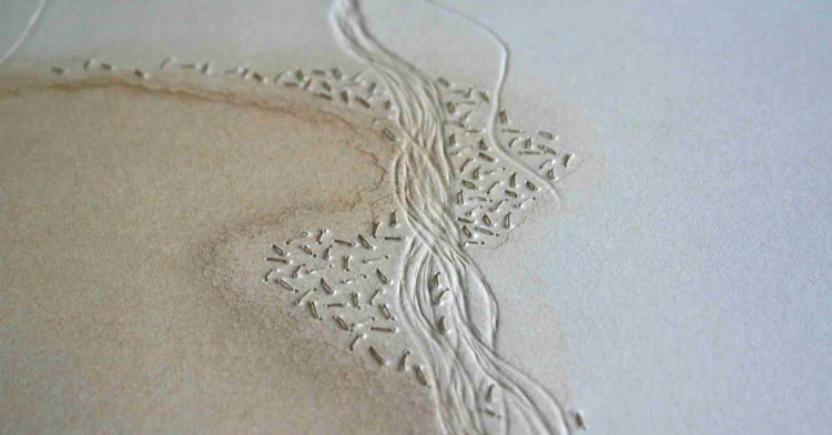
 Earlier on i discovered the artists Michala Gyetvai and was very fascinated by her artwork. I wanted to have an attempt at sewing on felt like her artwork. However, i wasn't able to complete the felting and didn't get much time to sew a detailed image on it. With the short time i had i sewed a few lines on the felt and found it very soothing, as if i was sewing into a cloud. I followed the grey lines with my thread and thought the straight lines reminded me of astrology zodiac star lines. It would've been nice to have built these threads up so they stood out more boldly in the felt. This quick experiment does not look at all similar to Gyetvai but i'm glad i had a quick go as i would definitely like to try to create an actual image working with the felting as background. I also like the idea of the star lines, or simple detail on the felt for instance using black for the background then sewing white star details to create the astrology lines.
 In a quick experiment i had a go at using wire to create a weed flower. Shaping the wire was difficult especially for the head as i had to loop it around, i couldn't get the wire to create a round head like the weed would appear. Additionally, i would need to build up the wire of the stem for it to be able to support the head. Then i wrapped a clear fabric around the head but couldn't get it to stay in place.
I like the use of wires and cooperating them into my work however i struggled with just using wire and do not like the outcome of this experiment as it looks a mess. On the next page i wrote out some lyrics from a song called "Weeds" by Marina and the Diamonds as i like including song lyrics in my work. I also wondered if i could pick them apart and create a title for my final piece. I felt the lyrics were not close enough to the actual topic that i was exploring, "needs to be cut at the root" could be tied in as a way to say that people should not be suffering with this unhealthy mentality and need to cut out society's expectations. However, i decided i didn't want to use words in my final piece and have the meaning be told by the images and allow the viewer to create their own views.
 Weeds became an important symbol in my idea as if the weeds were the unhealthy ideas growing in a person's mind after being influenced by the media (which planted the seeds). I collected some basic weeds from my garden and the side of the paths on my way and back from college. I collected some leaves, dandelions, groundsel, buttercup, daisies and bluebells. I liked the idea of sewing or creating the images of weeds growing up like an unhealthy idea growing in the mind and creeping in unwanted. I wanted these weed images on fabric so decided to place some on a scrap of grey fabric i had from a cut up t shirt.
  I especially like how the white and yellow colours popped against the dark grey and believe this alone could be a simple piece, maybe paint the flowers on the fabric. That option sounds more reasonable as the flowers would die and crumble losing their bright fresh look. I stuck a price tag onto the page, connected to the grey fabric as it made me think about how the media sells and encourages their expectations through dieting, slim models etc. These toxic standards are shoved down people's throats to scam them from money as well as make people feel insecure and need to fit in. So for this piece to convey the idea of selling weeds i felt was quite fitting. This was a quick, improvised piece so lacks in some areas, for instance i stuck some random black thread to the page and didn't take into consideration their purpose and effect on the page. I could have built up the threads and create the basic shape of a human head to represent the mind through lines, to show the weeds growing in the mind. Furthermore, i dislike the use of tape to stick the flowers on. I would of prefered to have sewn them on but i knew the flowers would soon crumble so thought the tape would help hold the flowers longer.
I really like the simple collage created here and believe i could definitely develop this into a higher quality, complete piece of artwork. Additionally, i should try painting the weeds on the fabric then try sewing details over it like the artist Josefina Concha; using fabric and painting are my two favourite materials so attempting this would be very interesting.
Thursday, 17 May 2018
Experiments

Using a free hand sewing machine, i sewed a flower then two weeds. I enjoyed the freedom of using the machine and the creation of random lines as you can not erase then. The use of continuous lines is effective, presenting the idea that the weeds are unstoppable and will continue to grow back again and again.
Furthermore, the thread lines layered over one another creating density within the weeds. I especially like this build up and would like to develop this by doing a more focused image with more colours in the threads. Therefore i would be able to see the changes and layering of the threads more clearly; the colours would show up and present the direction of the lines.
When sewing and moving the fabric around i didnt keep it straight which created creases/pleats from the sewing. However, i really like this detail as it adds to how weeds corrupt things and break pavements when growing through cracks. This is something i could develop when using this machine. I could fold the fabric whilst sewing an image or create more carefully crafted pleats in the fabric.

After seeing an instagram video of this technique i thought it was quite soft and interesting so decided to try. I didn't decide to create a certain image but instead just practice the style and grow comfortable with it. I was limited on materials but by using a tick needle i pushed the materials through and shaped it along the way. I also used thread and created thinner lines.
To develop this i would like to try layering the materials on one another and also create an image that is more detailed. I would also like to experiment with other materials and see what else can be used with this technique.

 Next i tried felting which was very intriguing and i would definitely like to develop further. The method is simple and can be very improvised with the layering. I would like to try and take this further so the whole piece becomes very thick, in some places maybe leave some areas more empty like a hole.
For this i would like to experiment with colours and shaping of the felt when pressing it together. I especially like creating thin lines and shaped so i would like to see this built up with many layers. Additionally, i want to try different external materials to see how they mix in when bonding the felt.

 Lastly, to completely take this method further i would like to use this technique to create an image. To do so i will look at artists specialising in this area and use their artwork for inspiration.
I found artist Michala Gyetvai who creates backgrounds with felting, then sewing in details. I find their work very eye catching and would definitely like to try as it is completely textiles and would challenge my sewing skills which i hardly use so i would be developing two sets of skills.
Sunday, 13 May 2018
Artists: Part 2
Her work is very abstract and bold with the use of electric colours. I really enjoy her method of creating and the straight lines shown in many of her works as it looks geometric.

Josefina Concha creates delicately stitched pieces using a free hand sewing machines. Her works are inspired by nature, skin, hair, plants and animals. I find her work interesting through the way she layers the threads when sewing to create volume in her work. Her technique is very expressive and that is something i am trying to pick up and create my own style of through my work.

Derick Melander collects old clothes from people and creates art pieces by folding them and stacking them to create a structure. I find his key to detail very intriguing as his artworks contain beautiful gradients of colour. Also i love using leftover/ old materials that usually are thrown away for being out of use.
Artists
 Alice Fox creates simple collagraphs using found objects and materials that connect to landscapes. She has a fascination for the natural world and also does stitching, weaving, printing and harnessing natural processes.
I find her use of an earthy colour scheme effective, helping the viewer to connect to the landscapes and feel the nature. Her collagraphs are quite simple but hold key to small detail and carefully placed materials that look very intriguing.

Jenny Davis is a visual artist who focuses on the imperfections, incomplete found in urban environments. I find we have similar interests in abandoned places, old industrial sites and graffitied walls. Davis creates paintings and collages using rough materials.
I like the sense of stories belonging to old abandoned places as the ageing/ruins show a story, and Davis captures this in her collages. They look used and hold a worn personality that you can connect too.
Cas Holmes creates collages using random fabrics sewn together. By using a free hand sewing machine to create detailed embroidery of flowers and animals. Her use of bright colours and intricate details in the embroideries make her work feel full of life like the summer. The sewn flowers look life like as if she took cuttings from her garden, this makes the viewer want to go outside and appreciate the real nature.

Tina Jenson creates collages that look worn and vintage. She uses textiles, paper and things she has discovered from travelling across Europe. Her artwork looks homely and full of character by using old photographs or images of nature. Her mixture of materials such as fabrics with paper, like postcards, interest me as they are materials anyone can own and have lying around.
Katherine Chang Liu creates painting inspired by the unfinished. Her artwork is to make people stop and think about the past, examine things and slow down to appreciate the process. I really like the unfinished look as it ties in with my fascination with abandoned places. The paint strokes and other materials are bare and rough.
Wednesday, 9 May 2018
Printing on Materials

I rolled out some ink until it was creating a sticking noise, then wiped away some to create lines using a Q-tip. I drew a simple, quick flower to use as a trial image for my prints on different materials. I pressed the piece of map over the top to transfer the ink and create a print. The map was washed with coffee to create an aged appearance. I thought the brown areas showing through the rough printing areas were really interesting as it continued this old look, as if the image was breaking down. I thought this method of printing was very simple but i also should develop my technique so i could create more skilled and detailed drawings in the ink and actually challenge myself.

I repeated the same print but instead used a piece from a kitchen roll. The tissue was stiffer then normal tissues so it stayed together when painted on. I used watercolor on the piece of tissue, letting them soak the tissue and mix, creating a light mix with the colours that were very aesthetic. I then printed onto the tissue. The ink picked up on the tissue dot design which i felt made the ink lighter and less of a block of colour. I also think this could be an interesting technique to develop where i only paint the areas that stand out of the page, leaving colour underneath and therefore could create an image. I also think the light colours really add delicacy against the black with the flower print.

My final print was a quick doodle on a piece of fabric. I placed the fabric on top of the rolled out ink and used a biro pen to press down and draw an image.
The ink acts really strong on the fabric the drawing has to be done carefully so the whole fabric doesn't pick up a load of ink and not show a design. Furthermore, i really like the bold, simple design of the flower on the light fabric. I could create a very bold, detailed drawing on this fabric, for instance a simple small drawing of a little girl. I think i would like to develop this and use more printing on this fabric as it comes out really bold. I think i would like to develop this technique by doing quick drawings but using this style of printing instead of drawing with pencil, pens etc.
Subscribe to:
Comments (Atom)